Brightening the Patient Experience Through Design: Children’s Minnesota Limited Stay Unit

Like many pediatric-focused health systems, Children’s Minnesota was experiencing a lack of inpatient and observation beds at their Minneapolis campus and needed to solve their capacity challenges to allow them to serve more patients. The Limited Stay Unit (LSU) serves less acute patients requiring extra observation and support, freeing up higher acuity beds in medical-surgical units and the emergency department. Typical patient stays in the LSU range from a few hours to a few days.
Before the new LSU was completed, the experience of stepping into the original unit at Children’s Minnesota would have taken you back in time to the early 1990s. With colored VCT floors, fluorescent lights, outdated MEP systems and wallpaper border accents, our architecture and interior design teams were enlisted to create a complete refresh that aligned with the aesthetic and new standard of care for Children’s Minnesota.
Untouched since 1990, the renovated LSU is now unrecognizable. The new 9,000-SF unit offers 14 comfortable rooms with a bright, fresh and sophisticated aesthetic, paired with whimsical and playful touches to meet the wide range of medical and emotional needs of young patients (from Children's smallest patients to teens) and their families.
The result exceeded expectations (and was even named as a finalist for Healthcare Design’s 2023 Remodel/Renovation Competition), but more importantly aided in one of Children’s biggest goals: to provide a new, clean, safe space for patients and families to feel truly cared for.
See the transformation below!
NURSES STATION: BEFORE
As the oldest unrenovated unit on Children’s Minnesota campus, the entire 9,000 SF unit had to be completely remodeled.
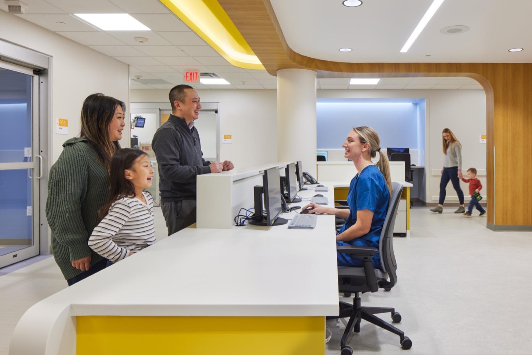
NURSES STATION: AFTER
The Children’s MN team selected a Minnesota river concept (incorporating a sunny abstracted tree canopy over the nurse station, undulating blue “water” flooring patterns, cheerful large-scale “lake side” graphics) that assists with navigation at decision points and illustrates an abstracted, kid-friendly national parks poster vibe.
PATIENT ROOM: BEFORE
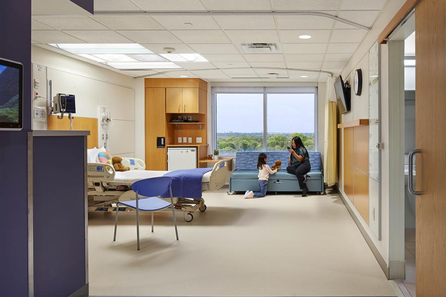
PATIENT ROOM AFTER:
A mix of patient rooms serve for the purposes of observation, overnight stays and treatment. Since the entire unit only had two exterior walls, priority was given to incorporating daylight into the overnight rooms.
MAIN CORRIDOR: BEFORE
The original unit offered a racetrack design with rooms along the perimeter walls.
MAIN CORRIDOR: AFTER
To refresh the racetrack design, the team looked for opportunities to support navigation and create a sense of place for patients and families. Embracing the Minnesota river concept, large-scale motifs create an experiential quality of walking alongside a river and highlight areas that patients would be seeking out including staff input, nurse’s stations and family lounges.
Learn more about our healthcare expertise and how we can support your projects big and small through thoughtful design and planning.
CONNECT WITH US
Contact Alena to discuss your healthcare design needs.


